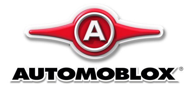
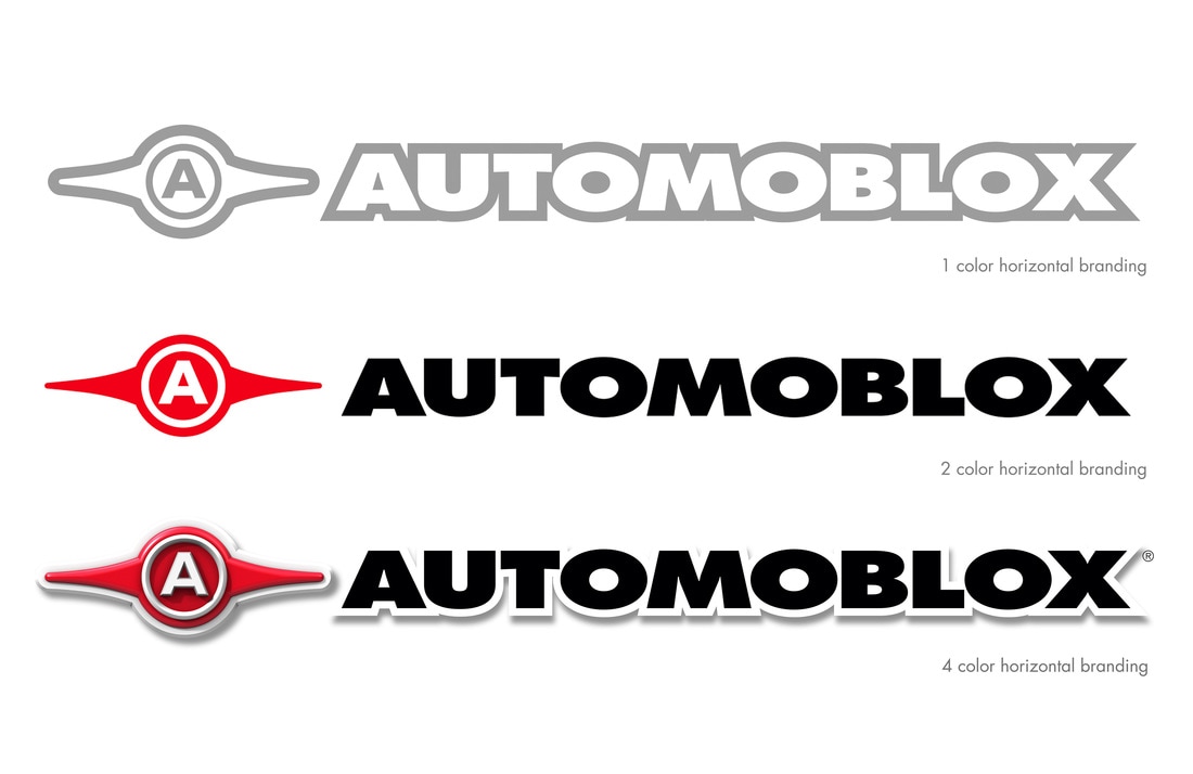
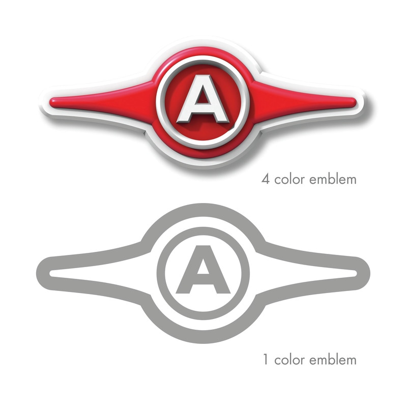
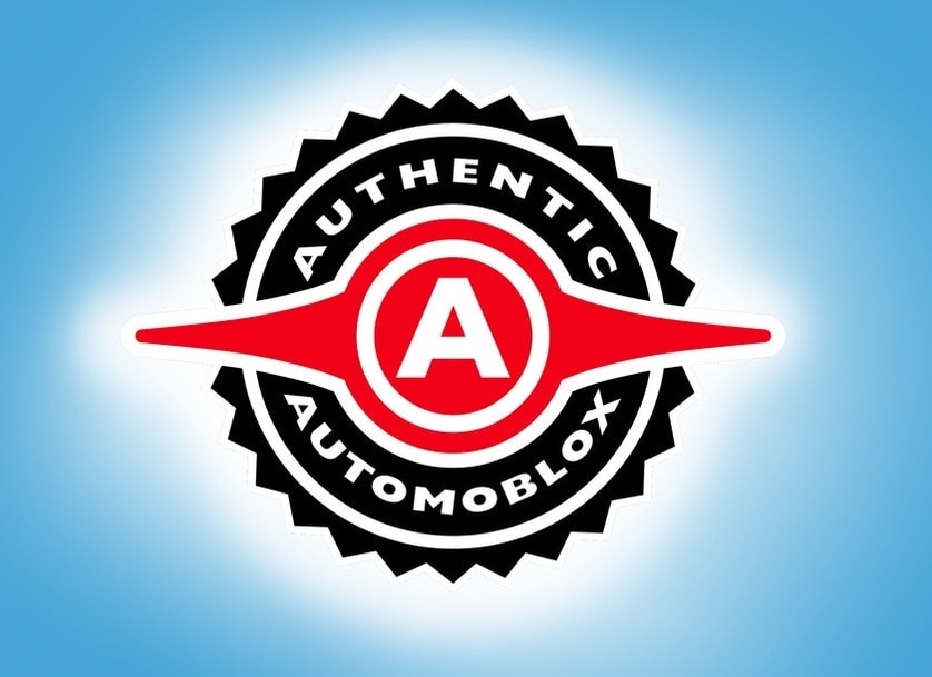
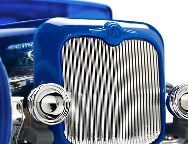
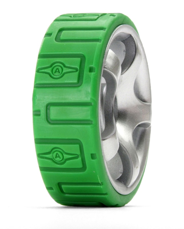
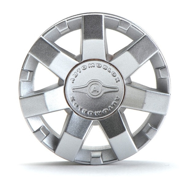
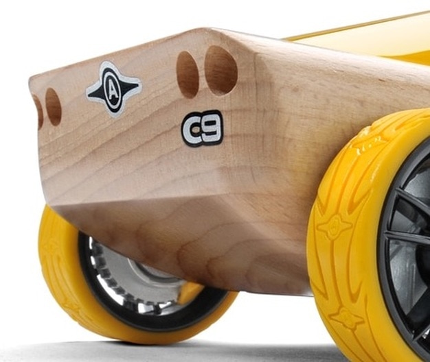
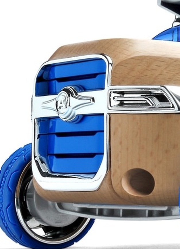
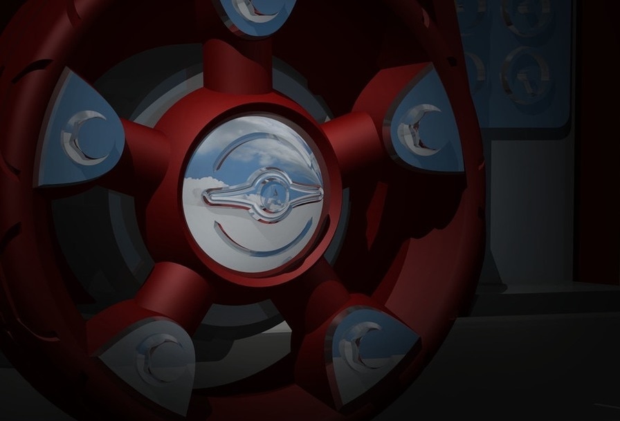
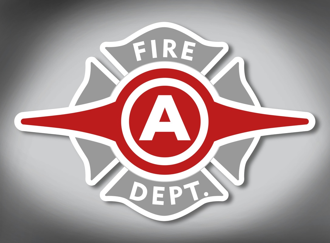
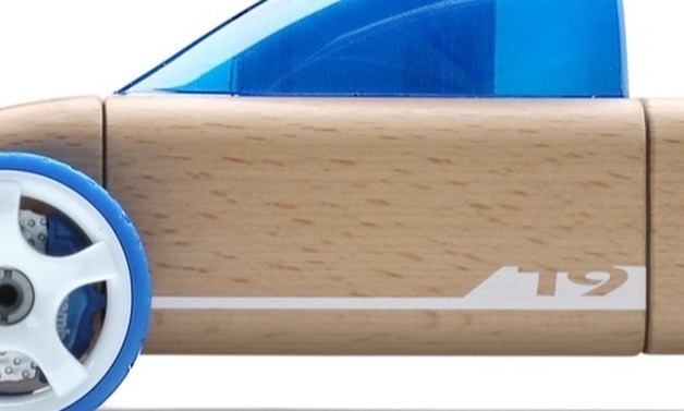
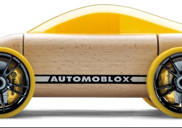
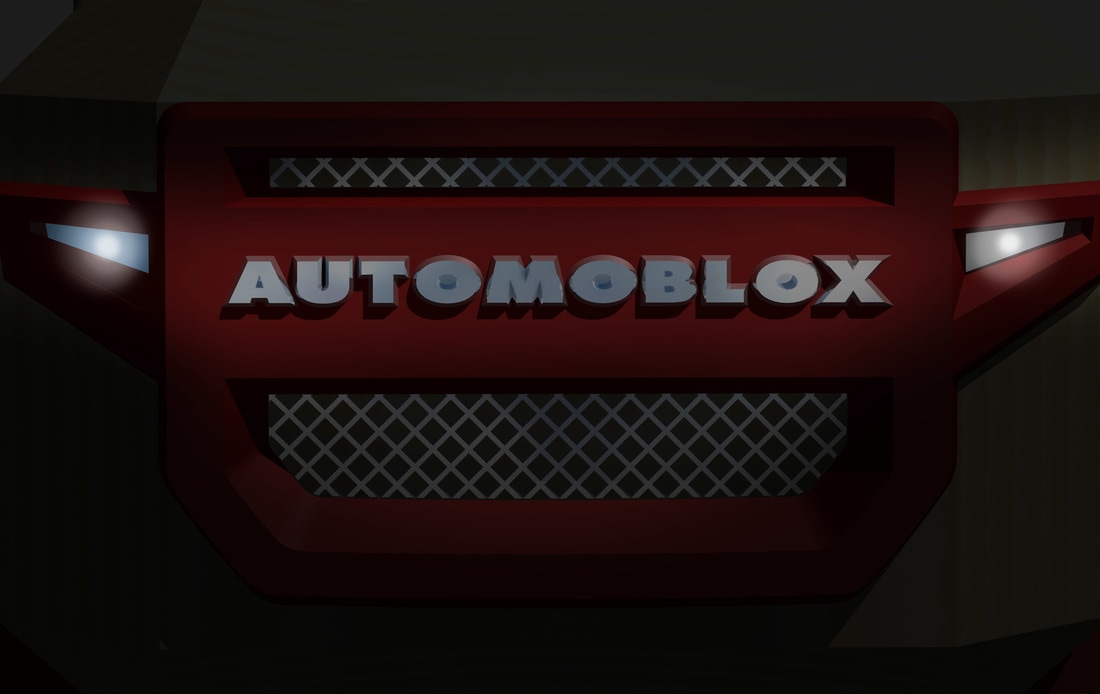
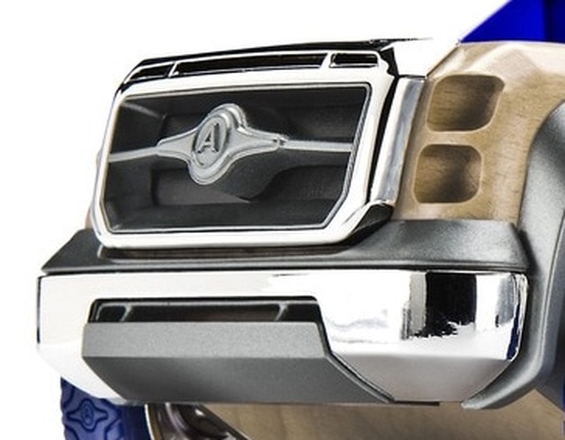
The story behind the mark.From the onset, the idea was to develop a global brand – one that would make a strong emotional connection with consumers. Automoblox® was never to be simply a toy but an experience. The logo mark was to be evocative of a traditional automotive brand but extremely clean and straight forward; the dimension in the 4-color version underscores this. The symmetry of the winged "A" emblem establishes a sense of harmony. The prominently featured white letter "A" is purposefully elementary to be both easily identifiable and a reflection on the market segment. This simplicity allows the emblem to remain readable at very small sizes. The bold, simple logo-type is both honest and familiar but substantially modified for this application. The prominent, high-contrast white outline permits the logo mark to live on any color or material field.
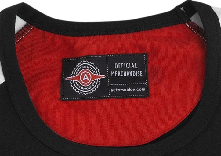
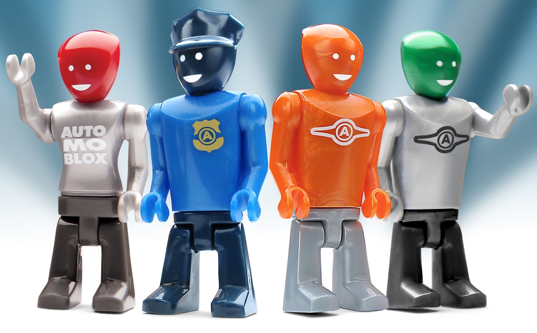
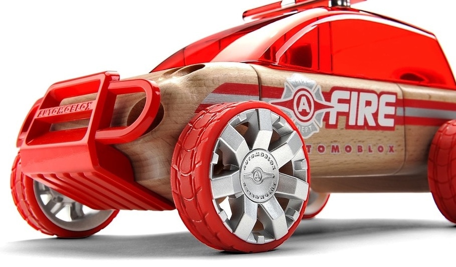
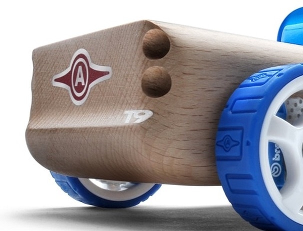
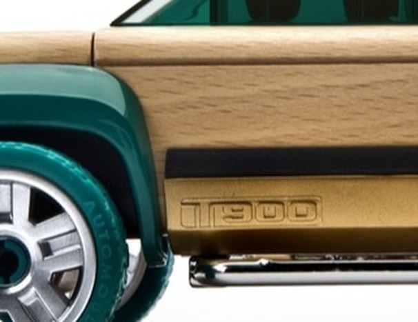
We suspected others would copy not just the look and feel of our products and brand but the whole idea of an automotive brand just for kids so we were sure to mark every one of our products with this seal.
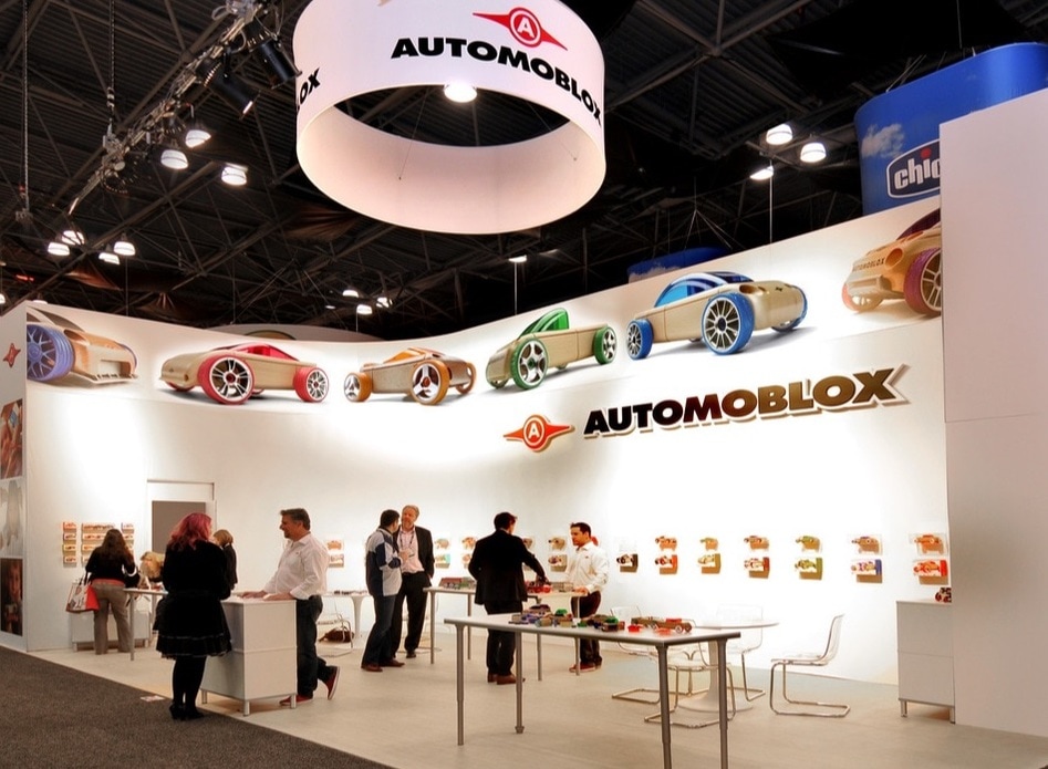
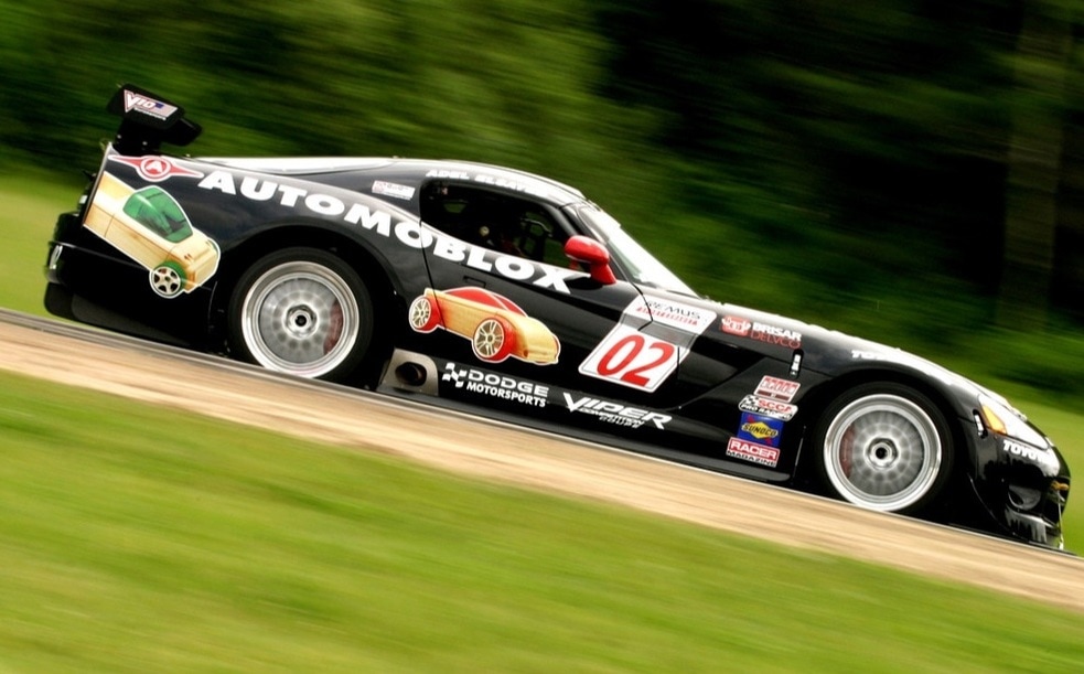
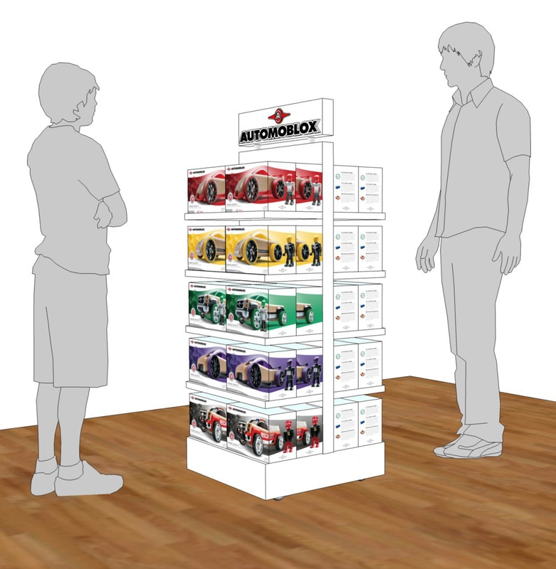
Huge impact at trade shows - a clean, simple approach with bright lights, impactful imagery and bold Automoblox® branding.
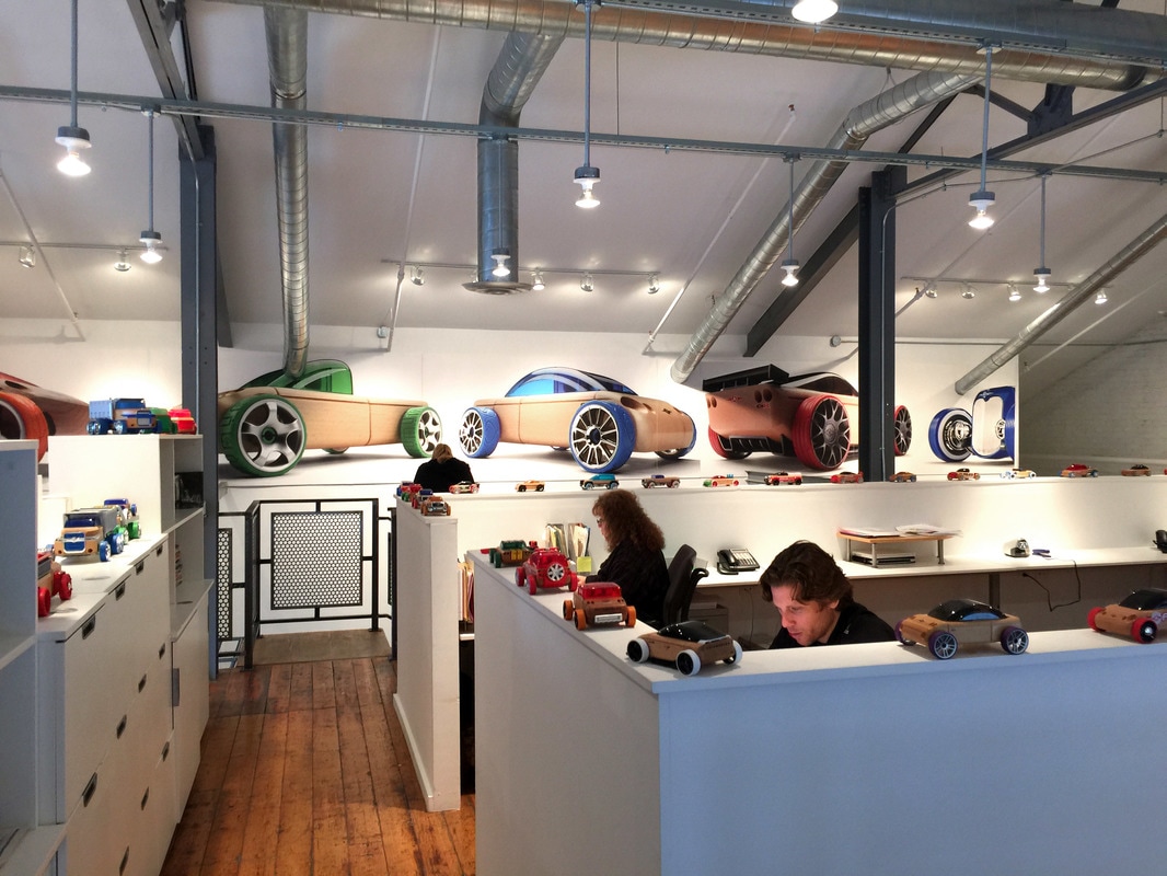
The Automoblox@ US offices were designed to reflect the look and feel of the brand.
|
|
